The Accessible Editor: Part Three — The Structured Things: Transcripts, Captions, and the Title Field
April 18, 2018
Previously: Part Two — The Structured Things: Alternative Text
We’ve taken a look at how to create accessible images, and in this section we’ll take that to the next level with moving images and sound, as well as how we label the pages we’re creating.
Creating Accessible Video and Audio: Transcripts and Captions
With captions and transcripts, we shift in focus from visual media toward audible media.
But that’s a bit of a misnomer. The idea that videos are captioned for the deaf or hard of hearing has become outdated. Now, videos are captioned because you have your computer’s sound down. They are captioned because you’re on a bus, or the quiet car. They are captioned because the text itself is easier to search and index, or because not everyone consumes information in the same way.
When it comes down to it, videos are no longer captioned just for a disability: they are captioned because having multiple options is always the best option.
As Eileen Webb says in her 2015 talk “Integrating Accessibility (external page),”
“Your video and audio content is not ready for the web until there are captions or a transcript.” – Eileen Webb
There’s a difference between the two content types, and it largely depends on the use of the video or audio and what you want to get of it.
Captions vs. Transcripts
Captions are useful when the video is meant to be viewed in real time with the text — a live event, or something in which the video is closely tied to the audio. With captions, you are tying your text directly to the video itself, which means in addition to the words, you have to consider time-stamping and matching that text to the correct spot in the video.
In most other cases, videos should be transcribed. The difference is subtle – transcripts separate the text from the audio and provide what is essentially an article view of the content.
The benefits of a transcript are that the video is no longer the focus: the text is. This obviously won’t work for live events, and if the text is closely tied to the graphics, it’s going to feel disjointed (or you’ll end up posting seven thousand screenshots within the body of the text) but for everything else, it’s positively the best option.
And it’s not all about videos, either. Any medium that requires sound should have a transcript attached to it unless, again, it’s dealing with live sound.
For example: podcasts, like Paul Ford and Rich Ziade’s Track Changes (external page). The full conversation of their podcast is listed in a blog post.
Or: conference talks. It’s a no brainer for me to transcribe the talks I give on my blog if they have been taped — you’re reading an example of it RIGHT NOW! — but even if it’s not recorded in some way, I make sure to post a transcript of it. It’s just good content.
The Benefits of Transcripts
Let’s go through the benefits:
- Accessible to someone who can’t see? Absolutely. Screen readers are always going to have an easier time finding and parsing text – especially if you editorialize a bit and provide real headings within the transcript.
- Better for people who don’t (or can’t, due to bandwidth or external factors) want to watch a video? Yup! Now they can silently read along with the video, and, because they can see the entire thing at once, they can easily scan and read the section that relates best to them.
- Better for SEO? Yup! You’re actually physically putting the text on your site, so those phrases are now indexable. And, they’re yours. You’re not throwing text into a partner service – you own this content now.
The Act of Transcribing: Thank You YouTube (and Transcribers)
For both transcripts and captions, you can use a video hosting service like YouTube to handle the text itself.
What’s great about the YouTube service is that you can set it to auto pause whenever you’re typing, which allows for you to hold off the endless cycle of rewinding/playing/pausing, etc. that you might have to tackle otherwise.
Then, when you’ve got your transcript, you copy and paste it where you need it to go. Delete the video from the service (if you don’t want it anymore) and you’re good to go.
One thing to note: even though the tools make it easy, transcription takes time. If time is an issue (but a little money is not) you can easily outsource this stuff to someone who can professionally transcribe for you. It might take a little bit of cleaning up — an external transcribed will always struggle getting names correct, understanding initiatives or jargon, or translating muddy voices or deep accents — but it’s going to save a lot of time and become a much more usable piece of content.
The Title Field: Announcing Your Intent
The title field gets used in about seventy million ways, depending on how the site is set up. It can be the navigation title, or it can be the title pushed for search engines to pick up. It can be the title of an article, and it can be the title of the piece of content itself within the CMS.
All of these uses have one major thing in common: they all contribute to wayfinding on the site, especially for someone who is using a screen reader to navigate content. The Title Field is important to accessibility because it is what is announced when a new web page is loaded. This is your time to shine — your first introduction to the page content, and it should be concise, accurate, and clear.
What this means is being clear about the page content. The title field is not a time to get creative – it’s a time to make things understandable.
Writing the Title Field
The basics are this: give an informative title that is short but understandable. Then, if it works within your templates, provide an organizational suffix.

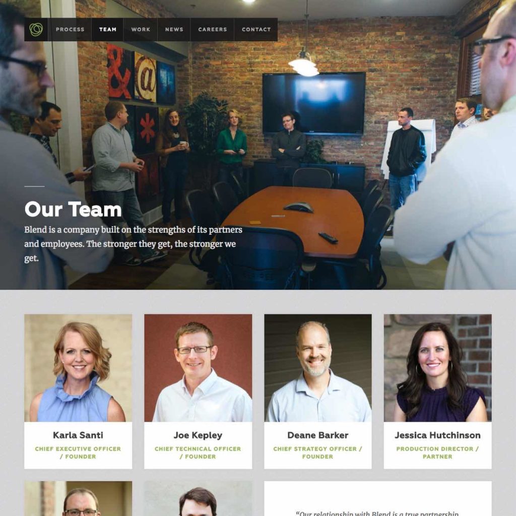
For example, on Blend’s site, we took the previous team page and created the following title:
Our Team | Blend Interactive
It works because it says exactly what it is – it’s a page that talks about our team, followed by a suffix of “Blend Interactive.”
NOTE: It’s important to make sure we put the title at the end, because people using screen readers are going to encounter this anytime they reach a page. Any time you show up in a browser history, or in a search engine result, that suffix is shown. We don’t the name of the organization to show up as a prefix, because it would be read and seen first every time. We don’t want a sea of Blend Interactive, Blend Interactive, Blend Interactive.
In our example, the title was easy and made sense because we had a clear message on the page. Yet, things aren’t always that clear, especially when brand terms and generalities are brought in.

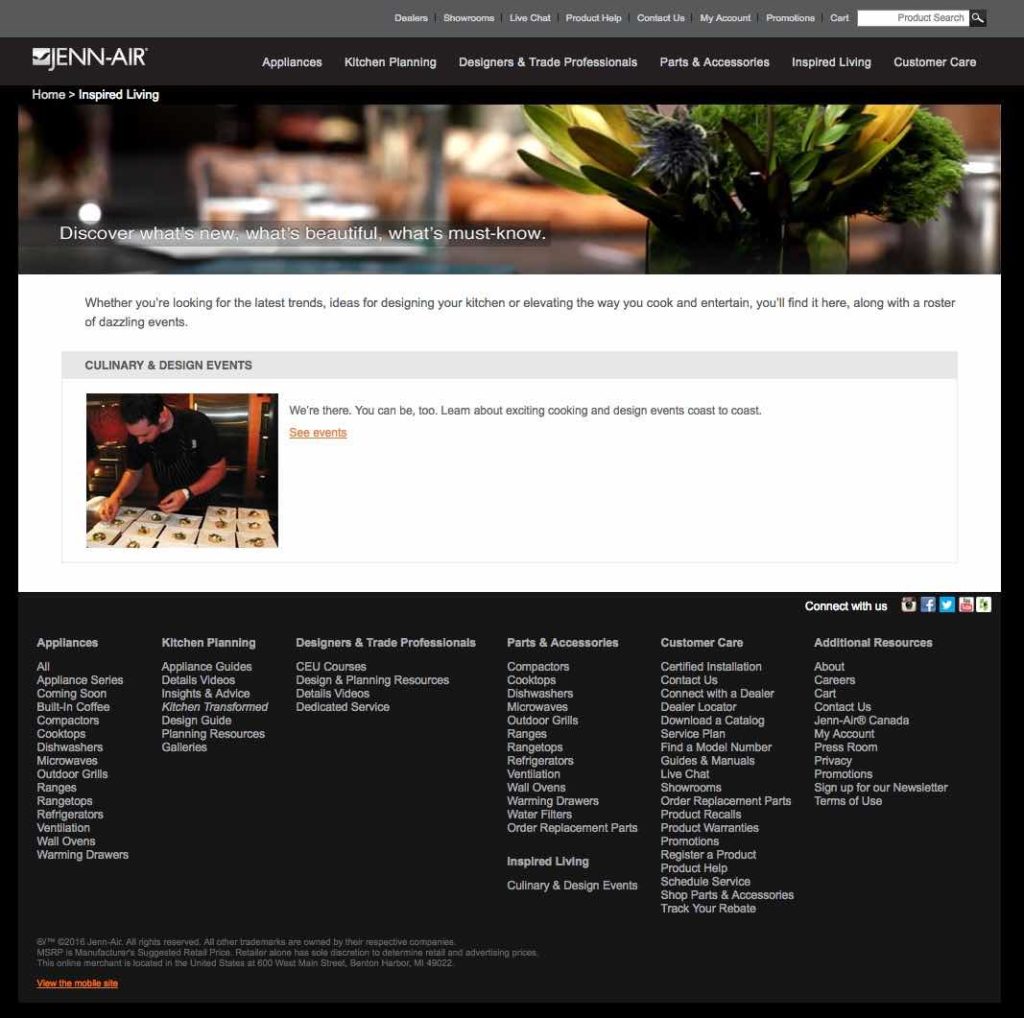
For example, here’s a page from Jenn-Air’s site. The title on this page – and of the entire section itself – is “Inspired Living,” which is a very vague and impossible to parse term for someone not familiar with Jenn-Air’s brand terms. As a site users, we have no idea what they mean by “inspired living,” and it’s even further muddled when we think about what a screen reader will hear upon landing on this page: “Inspired Living: Latest Trends in Kitchen Design & Culinary Arts | Jenn-Air”.
On first listen, we might think there’s going to be a list of trends on this page. In reality, there’s just a link to a design and culinary calendar. The right thing to do is to rewrite this title to be accurate: “Kitchen Design Trends | Jenn-Air”. But deeper than this, the content does not match the title we’re going for, so there’s a need not just to rewrite the content — we need to actually restructure the site map so that it goes directly to the calendar. This page shouldn’t be re-titled. This page should just go away.
Unfortunately, there aren’t rules to this. There’s no yes or no answer for what should be in these titles, just editorial judgement. For example, how would we tackle the undergraduate degree page of a regional university?
Would we do something short?:
Degrees
This feels too short, and not descriptive enough. Maybe we go the opposite direction, with something that’s very descriptive:
Undergraduate Programs and Majors, Liberal Arts College | University of Choice, Sioux Falls, South Dakota
This is stuffed with keywords, though, and that can actually harm more than help. Probably, it needs to be something clear and concise, right in the middle:
Undergraduate Programs and Majors | University of Choice
When it comes down to it, there are no rules — but, yet, the answers are pretty simple. Say what you need to say to help someone who cannot see the page or access the page through traditional means so that they understand with perfect clarity what is actually on that page.
No tricks. No keyword stuffing. No brand terms, unless they make sense in the context. Just simple, concise, and logical.
And if this sounds a little bit like we’re talking about writing… well, you’re right. And that’s for another post.
Next: Part Four — Inside the WYSIWYG: Plain Language

